by Eva Regin-Johnston | Jun 15, 2014
Företag:
Lindahls Yrkeskläder
Branch:
Kläder & Profilering
Lindahls Yrkeskläder vill skapa en ny kampanj för att lyfta fram brodyr, transfertryck, profilering och andra aspekter i sitt företag.
Relaunch, Branding and Marketing Campaign
 The logotype and branding are important part of the company identity.
In conjunction with the owners, we created a fresher look on their logotype.
New property sign for the venue.
Refreshed logotype goes on top of the current signpost.
Inside shop signs done on Banners
New design of their webpage
Solution:
Ad Campaign
• Portraits on location
• Photographing objects
• Design for print media
• Submitting final product
Logotype & Branding
• Stickers
• Car Branding
• Pens
• Balloons
• Signage for the shop
• Carpet with branding on
• Serviettes
• Take away Cups
• Take Away carry bags
• Menu Boards

by Eva Regin-Johnston | Jun 7, 2014
Company:
The Pantry
Branch:
Restaurant & Catering
The Pantry is a re-brand and launch of an existing business.
In 2012 we set up the previous brand, named Salladsbaren and when they decided to rebrand we where once again involved in the design and branding of their new venture.
Relaunch, Branding & Marketing Campaign
 The logotype and branding are an important part of the company identity.
In conjunction with the owners, we brainstormed the new name, building concepts that fitted with the vision and re-launch of the business.
The Pantry – ditt lokala skafferi (your local food cupboard) was launched on the 12 june 2014.
 New property sign for the venue.
There where already a light box on the property, so we measured the size and designed a new property sign.
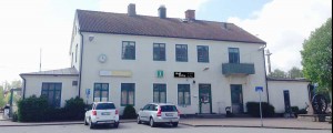
Actual size:
2500 mm x 500 mm.
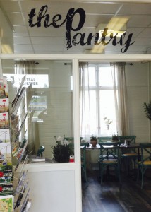 As the Pantry is situated inside the railway station, the main entrance is through the waiting hall.
Above the door is a glass wall, we popped the indoor sign for it here!
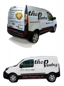 The Pantry also do catering service and a refrigerated minivan.
Kevii got the design job to ensure it got branding on, a local company added the branding onto the car.
This is the illustration that I made.
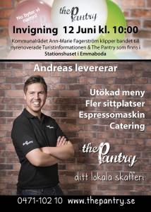 This is the A-Stand outside the premises.
We have made several A-stands to attract people to the launch and one to be put up after.
Both versions are being sent out via e-mail to local networks and published on the webpage.
Actual size:
500 mm x 700 mm
Date published:
09 June 2014
As this poster is quite big, we choose to include more information than in the daily newspaper.
They got 3 A-stands in the area, so this was printed for all of them.
 Sticker to add branding to packaging.
Actual size: 30 mm x 30 mm.
Small monter signs that can be hand written with information and price.
Actual size: 80 mm x 110 mm.
 Supplied art-work for t-shirt designs, the back has the following writing: “ditt lokala skafferi” that roughly translate to “your local food cupboard”
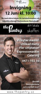
Local Media.
Gota Media is a media concern that runs several daily news paper in the south east of Sweden. Barometern & Östran are the two that covers the area in and around Emmaboda specifically.
To target the right market, and the launch of the new brand, it was decided to use several different media chanels.
Actual size on the local page for Emmaboda:
80 mm x 178 mm
Date published:
10 June 2014 & 12 June 2014
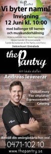
Emmaboda Tidning the local free news paper that comes out every second week, it covers Emmaboda specifically.
To target the right market, and the launch of the new brand, it was decided to use several different media chanels.
Actual size on the local page for Emmaboda Tidning: 124 mm x 365 mm (Standing Half Page)
Date published:
11 June 2014
As this ad is quite big, we choose to include more information than in the daily newspaper.

Solution:
Logotype
Photography
portrait
commercial
Design for
print media
online media
Branding
product branding
shop branding
Campaign
launch campaign

by Eva Regin-Johnston | May 1, 2014
Företag:
Lindahls Yrkeskläder
Branch:
Kläder & Profilering
Lindahls Yrkeskläder vill skapa en ny kampanj för att lyfta fram brodyr, transfertryck, profilering och andra aspekter i sitt företag.
Relaunch, Branding and Marketing Campaign
 The logotype and branding are important part of the company identity.
In conjunction with the owners, we created a fresher look on their logotype.
New property sign for the venue.
Refreshed logotype goes on top of the current signpost.
Inside shop signs done on Banners
New design of their webpage
Solution:
Ad Campaign
• Portraits on location
• Photographing objects
• Design for print media
• Submitting final product
Logotype & Branding
• Stickers
• Car Branding
• Pens
• Balloons
• Signage for the shop
• Carpet with branding on
• Serviettes
• Take away Cups
• Take Away carry bags
• Menu Boards
by Eva Regin-Johnston | Apr 1, 2014
Company:
Emmakliniken
Branch:
General Practitioner & Company Healthcare
Emmakliniken is a private health clinic that is partly funded and runs in conjunction with the government healthcare system (landstinget) of Sweden. Their first venue was opened on the 1 april 2014. We did an all round project for them.
Relaunch, Branding and Marketing Campaign
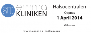
 The logotype for Emmakliniken Hälsocentral & Företagshälsa, the branding are important part of the company identity.
The font, the name, colours and symbols are all important parts of the graphical profile for a company.
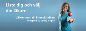
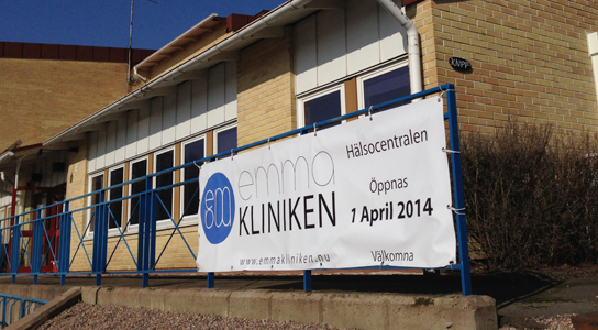 As soon as the logotype was created and approved, we printed up banners to ensure that the public knew what was going to happened in the venue and the launch date.
 This is the initial illustration to show how the signs will be placed.
Very small adjustments where made to the final design and the freestanding sign are now lit with the rest of the building.
Kevii project managed with third party vendors.
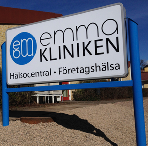 The freestanding sign.
Kevii designed the sign and collaborated with the following companies.
• Iron stand & coating – Lasema
• Aluminium frame & led lights – LEDenergy
• Plexi glass – Emmaboda Glasmästeri
• Text for sign – Svepreklam
• Electric installation – Emmaboda Elektriska
• Sign installation – KNPP
Kevii has the philosophy to build bridges between organisations and companies within the local community that our client work in. We believe that it strengthen our clients position, especially if they launch in a new region to be interactive and proactive in their approach to new customers.
We have a square sign outside by the front entrance door.
On days with seminars there is also a roll-up that easily can be brought with or set up to highlight the event.

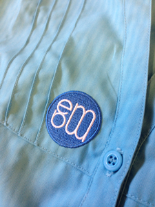 The logotype is embroider on the staff work clothing, enhancing the profile of the company’s identity.
As the staff are wearing silver name badges, only the logotype is needed on the clothing.

Professional portraits of staff.
Doctor, Johan Flodin
Doctor, Hoshang Diliwi
Doctor, Sven-Olof Strömblad
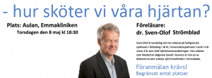
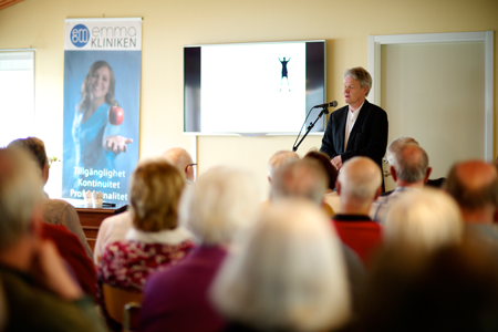 Seminars and Events
Roll-up are great ways to enhance your business and a professional touch to your seminar or event.
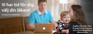
Via the clients website and facebook page.
Here are a couple of examples on how the header looked.


Solution:
Logotype
Photography
portrait
commercial
Design for
print media
online media
Branding
product branding
shop branding
Campaign
launch campaign
by Eva Regin-Johnston | Feb 5, 2014


 The logotype and branding are important part of the company identity.


 The logotype and branding are an important part of the company identity.
 New property sign for the venue.
 As the Pantry is situated inside the railway station, the main entrance is through the waiting hall.
 The Pantry also do catering service and a refrigerated minivan.
 This is the A-Stand outside the premises.
 Sticker to add branding to packaging.
 Supplied art-work for t-shirt designs, the back has the following writing: “ditt lokala skafferi” that roughly translate to “your local food cupboard”


 The logotype for Emmakliniken Hälsocentral & Företagshälsa, the branding are important part of the company identity.
 As soon as the logotype was created and approved, we printed up banners to ensure that the public knew what was going to happened in the venue and the launch date.
 This is the initial illustration to show how the signs will be placed.
 The freestanding sign.
 The logotype is embroider on the staff work clothing, enhancing the profile of the company’s identity.
 Seminars and Events